All too often we see this scenario from businesses: The business runs an A/B test, they see a lift in conversions, and then are quickly let down when their “winning” variation doesn’t bring them more revenue.
The majority of the time, this occurs because businesses test button clicks or some other meaningless element on the page when all that really matters is what increases your bottom line.
Keep in mind your bottom line and always test for revenue.
You may have seen this famous test from Hubspot.
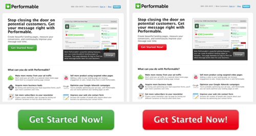
In it, they test which button color led to more clicks. Versus the green, the red button won by 21%. Now 21% is quite a huge lift in conversion rate optimization, but it doesn’t necessarily mean that there is a lift at the bottom of the funnel.
They do mention that “by getting 21% more people to click at the top of this process, we added 21% at the bottom as well.” Still, they do not explicitly state that we received 21% more sales/leads.
I believe what they mean is by getting 21% more people to click past the first part of the funnel, there are 21% more people in the next part of the funnel and some are likely to convert. This logic seems to make sense, but there are times when it has its flaws.
To Demonstrate. Let Me Tell You a Story
Meet Bill. Bill has an ecommerce website and sells outdoor equipment. Ski season is coming up and he just got his hands on the hottest pair of skies on the market. So, as usual, he has his designers whip up a banner image to slap on his homepage. After 2 weeks of running the banner, he decides to have his designers whip up a second banner with different button copy.
He set up his tests and the data starts pouring in. After 2,000 visits, version B has 200 conversions while the original only has 120. Version B was converting 66% higher than the original with a 95% confidence interval. Ecstatic, Bill changes over the banner to the new version waiting for the increase in sales… but it never came. Why? Because a conversion was tracked when someone clicked the button on the banner, not when someone actually purchased.
If Bill would have been testing for revenue, he would have seen that his original CTA actually lead to 5 more sales than Version B.
You may be wondering, if you are able to get 21% more people (like in the Hubspot example) and 66% more people (like in my fictional example) down the funnel, then shouldn’t you focus on optimizing the next page in the funnel? The answer to that question is: it depends.
First, you must ask yourself the following questions.
1. Are Users Being Mislead?
Let’s take the example of Bill. He changed his CTA in variation B and had 80 more click throughs to his product page but less purchases. What did he change his button copy to? In the original version, it said “Add To Cart” on the button and sent visitors to their cart with their item in it. In the variation, it said “View Skis” and also sent visitors to their cart.
The wording in the second CTA is misleading because it suggests that the visitor will have time to view the product before they decide to add it to cart. The original version tells the visitor exactly what is going to happen if they click the button. This confusion can make users feel mislead which is what most likely caused less sales for Bill.
2. Am I Selling Before The Customer Is Ready?
To explain this concept, I’ll use an example of a test we ran with a client of ours. The client had a landing page that we designed for them that was fairly long and had a nice big add to cart button above the fold. Below that button, we explained the value proposition and the product we were trying to sell hoping that visitors would be convinced and then purchase.
Our hypothesis was that having the add to cart button above the fold was enticing too many people to click it before they were actually convinced. For our variation we made a longer page where the add to cart button was at the very bottom. Below are our test results.
One of the conversion goals we measured was how many people clicked “Add To Cart.”
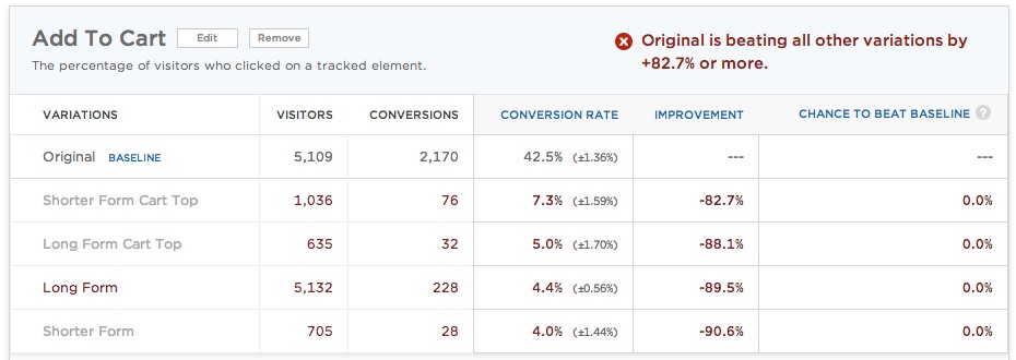
As you can see below, the original is far outperforming the variation by a long shot. 42.5% vs 4.4% in the variation. We also tested for revenue and got a completely different result.
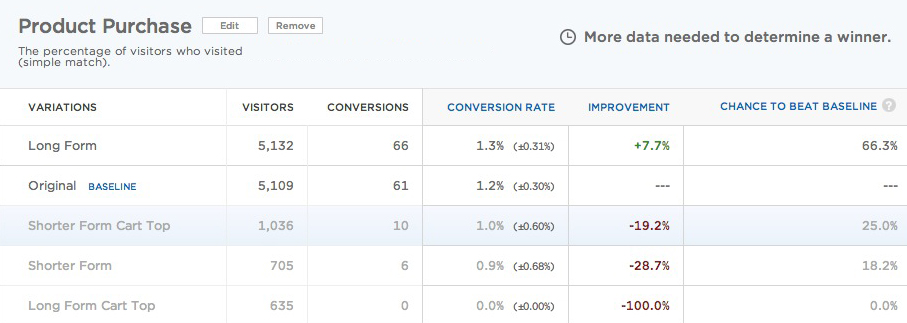
When testing for revenue, the long form (which was just losing in the other chart) was converting at a higher rate. Though the conversion rate was only up by 7.7%, the fact that it was winning is an indicator of how important testing for revenue really is.
The reason why the long form performed better is because visitors had to actually read and view the landing page before they clicked the add to cart button. So although there were substantially less people going to the checkout page, those that did go were much more convinced because they had all the information.
Key Take Aways
It’s easy to be swept up in what looks like huge conversion increases. But if what you are measuring as a “conversion” is not your bottom line, then you’re making decisions on bad data. So when applicable, always test for revenue.
Written by Mark Pecota